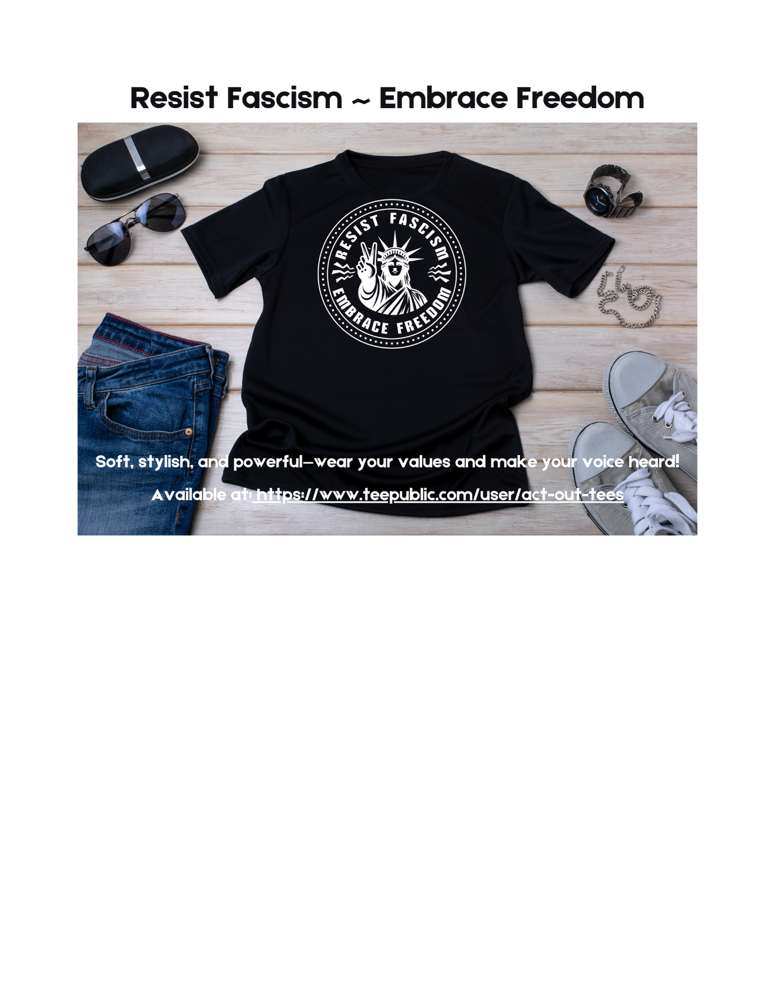
Resist Fascism ~ Embrace Freedom
Stand for justice and freedom with our bold statement for those who believe in democracy, equality, and the power of resistance. Wear your values and make your voice heard: Soft, stylish, and powerful!
#Freedom #Justice #Equality #Resist #Felon47 #Democracy #Activism #Unity #Strength #Courage #Truth #Progress #StandUp #HumanRights #POD #Power
Act Out Tees ~ where creativity meets self-expression ~ www.actouttees.com
Recent searches
Search options
#pod
2 posts2 participants0 posts today
Freedom for All ~ Not Just Some
True freedom knows no exclusions. Our design is a powerful reminder that justice, equality, and rights should be for everyone — not just a few. Wear this statement piece and stand for a world where freedom truly means.
#Freedom #Equality #Felon47 #POD #Justice #HumanRights #Inclusivity #StandUp #Unity #NoDiscrimination #ForEveryone #Activism #Progress #Fairness #Diversity #Empowerment
Act Out Tees ~ where creativity meets self-expression ~ www.actouttees.com

Resist Fascism ~ Embrace Freedom
Stand for justice and freedom with our bold statement for those who believe in democracy, equality, and the power of resistance!
#Freedom #Justice #Equality #Resist #Felon47 #Democracy #Activism #Unity #Strength #Courage #Truth #Progress #StandUp #HumanRights #POD #Power
Act Out Tees ~ where creativity meets self-expression ~ www.actouttees.com
#WritingCommunity who use #IngramSpark or people general #POD experience — advice needed re colour range for printing.
The ebook cover for my next release is mildly yellow; the print version comes out pretty much white. This has happened with a couple of previous books (apparently I like a pale cream colour in my covers), and I’ve let it roll, but I’d prefer this one to maintain a stronger yellow.
In the interests of not spending $30 a go (postage is a killler here) in adjusting the colour and ordering the proof, is there some way of knowing at what point the colour will be dark enough to be obvious?
(I was going to include a photo, but ironically enough, a cover that looks white to the naked eye comes out cream in the photo  )
)
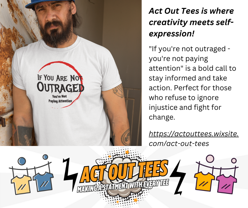
If you're not outraged - you're not paying attention
#Felon47 #WakeUp #StayWoke #Outrage #POD #Truth #Justice #Activism #Resist #SpeakUp #FightBack #Equality #NoSilence #Awareness #StayInformed #Revolution
Act Out Tees is where creativity meets self-expression ~ www.actouttees.com

Same slow service, now with increased pricing. What's not to love?
https://methodsetmadness.blogspot.com/2025/03/dtrpg-print-costs-will-increase-on.html

methodsetmadness.blogspot.comDTRPG print costs will increase on April 1DriveThruRPG is set to significantly raise the cost of print-on-demand products, with an increase ranging from 20% to 80%, as mentioned on R...
Better to Remain Silent...
#POD #silence #words #Felon47 #wisdom #thoughtful #clever #observer #quote #humor #philosophy #quietpower #thinkbeforeyouspeak #intelligence #mindfulness #selfcontrol
Act Out Tees is where creativity meets self-expression ~ www.actouttees.com

Sorry! But Ignoring It Is What The Germans Did!
#NeverForget #SpeakUp #StayVigilant #HistoryMatters #Resist #NoSilence #Justice #Truth #Activism #StandUp #FightHate #HumanRights #Felon47 #POD #LearnFromHistory #StayAwake
Act Out Tees is where creativity meets self-expression ~ www.actouttees.com

RESIST THE RIGHT
#Resist #FightBack #Equality #Justice #Felon47 #Progress #NoHate #Activism #HumanRights #Democracy #POD #StandUp #PowerToThePeople #AntiFascist #SpeakTruth #Unite
Act Out Tees is where creativity meets self-expression ~ www.actouttees.com
Stand With Ukraine
#StandWithUkraine #SupportUkraine #Freedom #Felon47 #Peace #Justice #Democracy #Resist #Solidarity #NoWar #POD #SlavaUkraini #UkraineStrong #DefendFreedom #HumanRights #StayUnited
Act Out Tees is where creativity meets self-expression ~ www.actouttees.com
Educate ~ Organize ~ Mobilize
#felon47 #POD #educate #organize #mobilize #activism #changemakers #empowerment #knowledgeispower #unity #action #justice #advocacy #leadership #community #progress
Act Out Tees is where creativity meets self-expression ~ www.actouttees.com
The Problem With Political Jokes Is Sometimes... They Get Elected
#Politics #Satire #Truth #Humor #Elections #Felon47 #VoteSmart #Reality Check #PoliticalJokes #Irony #POD #Democracy #Think #Speak Up #Laugh #Wake Up
Act Out Tees is where creativity meets self-expression ~ www.actouttees.com
Fascism = Oppression
#Freedom #Justice #Resist #Equality #HumanRights #Democracy #NoFascism #StandUp #Activism #PowerToThePeople #Truth #Oppression #Felon47 #POD #FightBack #DefendDemocracy
Act Out Tees is where creativity meets self-expression ~ www.actouttees.com
Act Out Tees is where creativity meets self-expression
www.actouttees.com
TIME TO FIGHT BACK AND LET THEM KNOW WITH “NOT MY PRESIDENT”
#notmypresident #resist #activism #protest #politics #accountability #democracy #standup #dissent #freedom #speakout #felon47 #POD #resistance #changemaker #justice